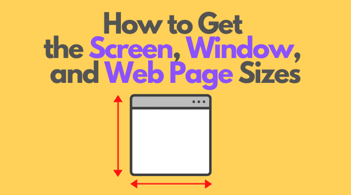
To detect whether the browser window is in landscape or portrait mode, you can compare the browser window's width and height.
But from my experience it's easy to get confused in the bunch of sizes: screen, window, web page sizes.
How are these sizes defined, and, importantly, how to access them is what I'm going to discuss in this post.
Table of Contents
1. The screen
1.1 The screen size
The screen size is the width and height of the screen: a monitor or a mobile screen.
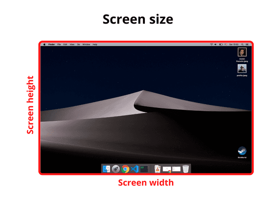
window.screen is the object that holds the screen size information. Here's how to access the screen width and height:
const screenWidth = window.screen.width;const screenHeight = window.screen.height;
1.2 The available screen size
The available screen size consists of the width and height of the active screen without the Operating System toolbars.
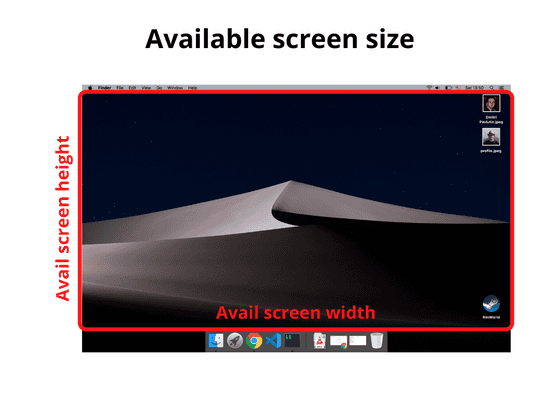
To access the available screen size you can use again the window.screen object:
const availScreenWidth = window.screen.availWidth;const availScreenHeight = window.screen.availHeight;
2. The window
2.1 The window outer size
The window outer size consists of the width and height of the entire browser window, including the address bar, tabs bar, and other browser panels.
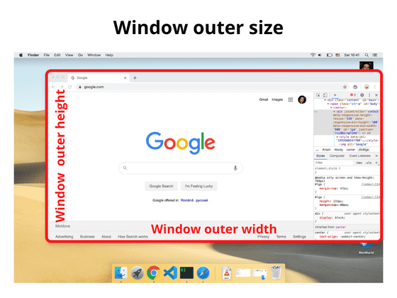
To access the outer window size, you can use the properties outerWidth and outerHeight that are available directly on the window object:
const windowOuterWidth = window.outerWidth;const windowOuterHeight = window.outerHeight;
2.2 The window inner size
The window inner size (aka viewport size) consists of the width and height of the viewport that displays the web page.
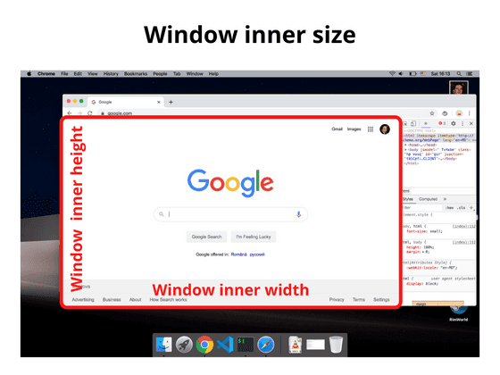
window object provides the necessary properties innerWidth and innerHeight:
const windowInnerWidth = window.innerWidth;const windowInnerHeight = window.innerHeight;
If you'd like to access the window inner size without the scrollbars, you can use the following:
const windowInnerWidth = document.documentElement.clientWidth;const windowInnerHeight = document.documentElement.clientHeight;
3. The web page size
The web page size consists of the width and height of the page content rendered.
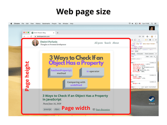
Use the following to access the size of the web page content (includes the page's padding, but not border, margin or scrollbars):
const pageWidth = document.documentElement.scrollWidth;const pageHeight = document.documentElement.scrollHeight;
If pageHeight is bigger than the window inner height, then a vertical scrollbar is displayed.
4. Summary
Hopefully, now you have a better idea of how to determine different kinds of sizes.
The screen size is the size of your entire screen (or monitor), while the available screen size is the size of the monitor excluding the OS taskbars or toolbars.
The window outer size measures the entire browser window (including the address bar, tabs bar, side panels if opened), while the window inner size is the size of viewport where the web page renders.
Finally, the web page size is the size of the web page with its content.

